
Responsive and Mobile-First Web Design for Better Conversions
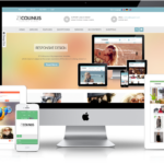
In today’s digital world, most users access websites through smartphones and tablets. At Abaci Web, we prioritize mobile-first design to ensure your website looks flawless on any device. Responsive layouts enhance user experience, reduce bounce rates, and improve conversion rates. By implementing flexible grids and mobile-friendly elements, your website can engage visitors instantly, no matter the screen size.
Minimalist Design with Clear Calls-to-Action
A clean and simple website helps visitors focus on what matters most: your products, services, and calls-to-action (CTAs). Abaci Web incorporates minimalist design principles that remove distractions and guide users toward action. Strategically placed buttons, concise content, and visually appealing layouts encourage visitors to explore and convert faster.
Engaging Visuals and Interactive Elements
Websites with interactive features like animations, sliders, and hover effects capture attention and make browsing enjoyable. Abaci Web uses engaging visuals that align with your brand identity, helping visitors connect emotionally. Interactive elements such as product demos, image galleries, and interactive forms not only increase engagement but also keep users on the site longer.
Fast Loading Speed and Optimized Performance
No matter how stunning your design is, slow websites lose customers. At Abaci Web, we optimize every website for speed, ensuring pages load quickly across all devices. Techniques like image optimization, efficient coding, and fast hosting improve user experience and boost search engine rankings. Faster websites directly contribute to higher conversions and happier visitors.


